
When bad data visualizations roamed the earth
They say history rhymes, but this is a goddamn carbon copy.

If you’re reading this, then you probably have a general sense of the politics of tech and UX. So that means you’re no stranger to the tragic tale of how the UX profession has managed to piss away every big break it’s had—every opportunity to become a strategic cornerstone of the tech industry—by treating UX jobs as some sort of vehicle for personal creative expression. The most vocal and visible “representatives” of our field (and I use that term through my teeth) did their damnedest to ensure we could not be taken seriously, and sure enough, now we aren’t. But you’ve heard this story too many times already for me to bore you with it again. I only bring this current state of affairs up because of its parallels to something that happened about 15 years ago.
In the early 2010s, a number of things were happening all at the same time:
Large data sets became available, allowing journalists to create charts illustrating this data for the public.
Social media platforms became the universal public forum, and gave rise to an audience of unprecedented size.
That in turn led to the rise of content marketing, which sought to create compelling media designed to go viral on those social platforms.
There was a cultural shift away from the aggressively anti-intellectual Bush era to a “look how smart I am because I watch TED talks” zeitgeist. Sharing “enlightened” content became a performative display. This meant that there was a market for viral content that was actually informative.
This is how the Great Infographic Boom was born. Suddenly every company on the planet had a budget to create infographics, whether for viral content or white papers or homepages, and every media outlet wanted infographics to make their stories more interesting (and viral). At its best, the Boom led to visuals of a sophistication that would have been unthinkable in mainstream media just a few years before. This below is from the New York Times.
And while all of this very public data visualization was happening, the Great Infographic Boom had another, less sexy, but more consequential side. SaaS was blowing up. Every B2B application had a need for charts to illustrate the data running through the system, reducing the cognitive load of the users, who were presumably more savvy than your average Pinterest or Trashable user. And the buzzword of the day was “Big Data”, promising unprecedented hoards of data that would necessitate new, innovative data visualizations.
Both of these phenomena—the public-facing educational and promotional infographics, and functional B2B SaaS charts—gave rise to a gold rush for data visualization designers. For a moment there, the demand outstripped the supply. Here was an opportunity to solidify a cultural change, increasing data literacy among the public, particularly in the form of multidimensional data, so as to increase the sophistication of public discourse beyond the smoothbrained black-and-white arguments that plague our society.
Buuuut, of course that didn’t happen.
The Age of Shit Infographics
Once the various companies had decided that they needed infographics, they pretty much waved their money in the air and offered the job to whoever would take it. The problem was, as already mentioned, demand for qualified data visualization designers outstripped the supply. This meant that these companies were unknowingly hiring charlatans and, in the process, funding the demise of data visualization.
While the early days of the Boom produced a number of interesting, useful visualizations, they were quickly crowded out by shit. And by shit, I mean shit. Here is just one example:
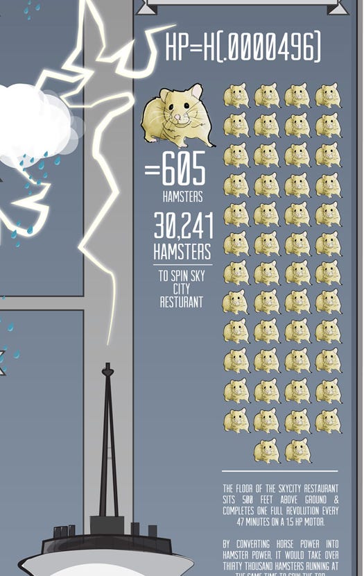
This is from an infographic about the Space Needle from a Seattle law firm (for some reason). It depicts the power of the motor that spins the revolving restaurant at the top of the Space Needle. While the choice to depict this figure in terms of rodents is itself juvenile, it could have at least been informative in a pointless way if the infographic’s illustrator had decided to show us what 30,241 hamsters yoked to a capstan would actually look like. But instead, they decided to abstract that figure into a completely meaningless unit chart in which each clip art rat represents a ludicrously arbitrary quantity. And keep in mind, unit charts are bad even when the unit represents a single thing, but this is something I had never seen before.
Then there is this masterpiece:
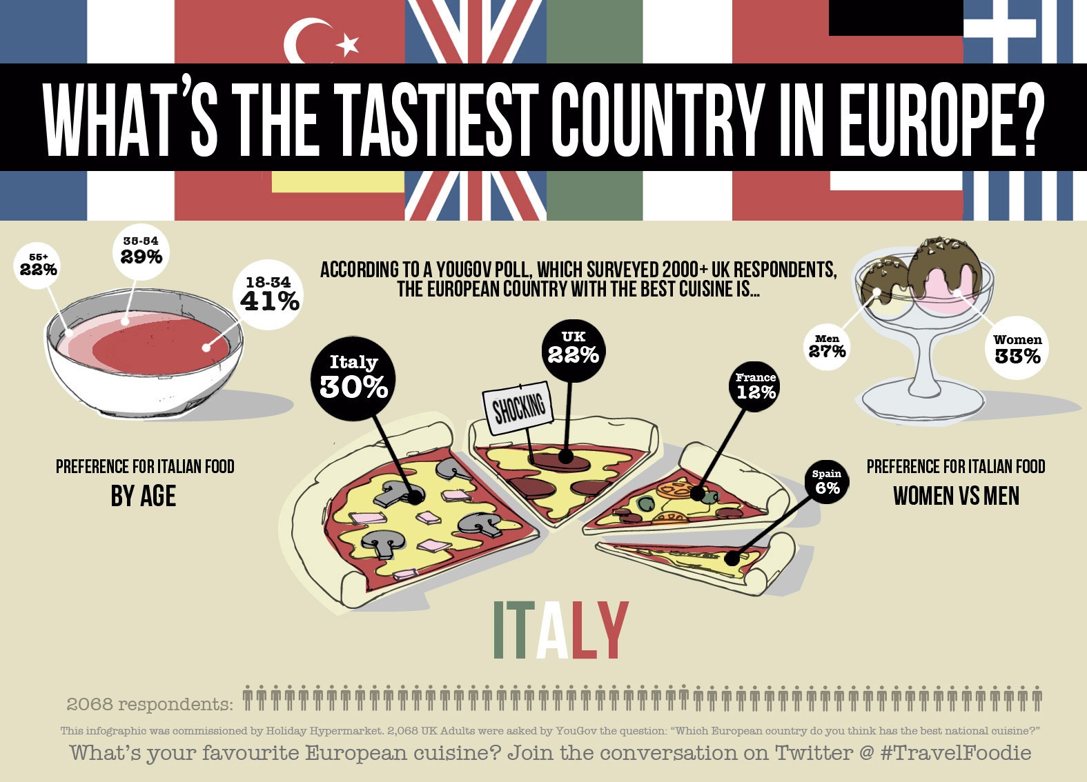
Note how the data is "visualized” in the shapes of the various food items in the drawing. Pie charts are already widely known to be completely worthless as information vehicles, and perspective pie charts are even worse. But turning your pie chart into a literal 3D pizza drawing violates taboos I didn’t even know existed. And that’s somehow the least worst of all of them. The ice cream in the upper right uses elliptical surface area to depict proportion which is another standard flouted, and the upper left drawing, I don’t even know what the fuck that’s supposed to be, but those shapes are perhaps the worst visualization of proportion I’ve ever seen in my life, no exaggeration. And then there is that copy+paste of men’s bathroom icons at the bottom. A tour de force.
But how about this one?

First off, note how there’s no actual visualization of data at all. At a certain point, the word “infographic” itself ceased to imply any charts. It was usually just photos yoinked from Google results, cut out, and plopped into a low-effort graphic. And this truly is low-effort. Note how the cufflinks are not visible, the shoes covered up, and Daniel Craig isn’t even wearing sunglasses at all. The artist could have sourced some images of those products instead of the lame Noun Project icons, but nope, that would be too much work. I guarantee whoever made this thing grew up (to use a phrase loosely) hearing how special and perfect they were. And it shows.
I should also mention the pervasive infantile vector graphics that were ubiquitous in this joke of a medium. I still remember this disaster of cringe stereotypes unironically presented.
You might assume I’m cherry picking particularly bad examples for this article, but you’d be wrong. I saw hundreds of these eyesores come across my social media feed, or on Trashable or Pinterest, back in the day. And there were whole cottage industries built around this crap. The last one comes from a local Seattle company that was infamous for low-quality work like what you see above.
Pervading pretty much all of it is a certain unmistakable snark that can be found in a certain generation of talentless hipsters. It’s a mixture of smugness and laziness whose signature can be detected at a glance.
Trickling up
The Great Infographic Boom lasted for several years, during which time the reputation of data visualization suffered immensely. As inevitably happens, this content made its way slowly up the corporate ladder, ending up in the hands of increasingly consequential individuals. This became their exposure to data visualization.
Meanwhile, the problem of low-skilled data visualization designers also occurred within tech companies. The shortage of qualified designers was felt as acutely here as it was for marketing agencies. With nobody present in corporate contexts to advocate for data visualization principles, the worst ideas tended to win out.
And if you don’t believe that stuff had an effect on companies’ data visualization policies, you haven’t been paying attention. I specialize in data visualization, and that’s what I did for a lot of companies, and I constantly found myself having to deprogram decision makers who had been inculcated with bad ideas. I managed to kill pie charts at four companies, but each time it was the same uphill battle that never got any easier. And other companies weren’t so lucky. This is an actual output from some business intelligence (again, loosely) product.

By the end of the 2010s, data visualization was regarded as something of a “solved problem” at SaaS companies. Throw in a doughnut chart, a bar chart (with rounded corners), and a line graph and call it a day. SaaS is where public data literacy could have started, as it would be used by somewhat savvy, and certainly motivated, individuals and from there trickle down to the rest of the population. Instead, everything stagnated. This is a missed opportunity.
Sound familiar?
Just as UX blew its many opportunities to make a good impression in the boardroom, the same way it squandered its moments of elevated bargaining power by allowing a bunch of man-bun-wearing fakers to Zerg-rush the career path and outnumber the professionals, the same damn thing happened in data visualization. A bunch of ironic manchildren showed up presuming to speak for the profession, and they were heard loud and clear.
And, just as UX is stumbling at exactly the moment when it is needed the most, data visualization is stuck in the 2000s when the world of the 2020s is far too complex to describe with words and pictures, or line graphs. So many problems in modern society originate in the failure of information technology to convey reality. Concerns about deep-fakes, voter misinformation, economic confusion, and AI hallucinations all stem from the fact that there’s so much stuff that every picture of the world that is based on anecdotes rather than data is by nature a lie of omission. And now, even data itself is falling into the realm of lies because data that is not sufficiently comprehensive is inevitably misleading.
But the only way to get large amounts of complex data into the minds of people is through sophisticated data visualization. Most people, myself included, don’t want to have to pore over statistics constantly, just so we don’t feel like we’re in the dark. Yet the data visualization tools available to most people are primitive, blunt instruments. Line graphs are great for simple correlations, and bar graphs can show proportions, but the things happening in the world today, whether it is the behavior of the economy, the climate, international relations, or the “brain” of whatever AI you use absolutely overwhelm these simple tools. The world is becoming a black box.
Over the last 15 years, we could have been developing new types of data visualization that bring powerful understanding to the average person, and normalizing those visuals in the culture. That did not happen because the narrative was hijacked by the least qualified people. Same as it ever was.
Guyz! I’m doing what I can
I don’t have a clever ending to this piece. I’m going to go out with a shameless plug. After seeing Edward Tufte in 2019, some ideas started bouncing around in my brain, and they culminated in the creation of this infographic:
The concept is to visualize complex phenomena over time. Just read the article and it will make sense. If you, the reader, have come up with original data visualization concepts, leave a comment.
Yep, that’s it. That’s all for today.
I respect the hell out of that.
Hey that historigraph is dope!
Actually didn't know you were in data viz. Agree with everything you said. So little mastery of the craft.
What most 'corporate leaders’ don’t realize is that UX is a data-driven field that transforms large amounts of information into simple, easy-to-understand formats. The confusion arises from people believing they’re doing the “right thing” by making quick, assumed decisions about what they think the data shows, but all they end up with is a crude, basic solution that only appeals to decision makers. Then, someone with genuine expertise in data visualization comes along, only to be laid off because “they weren’t as flexible” or “they weren’t like hipster McPaint face.”
The goal of making complex data understandable still has a long way to go. There's a lot of damage to fix before we can start presenting clear, transparent data instead of huge blobs and tiny font messages. It seems they're stuck in the PowerPoint era and aren’t fully utilizing design tools for meaningful purposes.